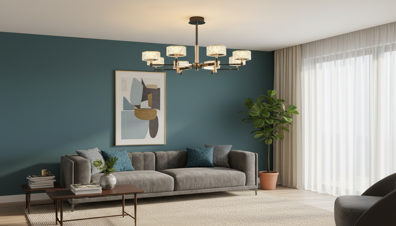
A sculptural pendant can unify a living room seating zone and a dining setting while keeping the ceiling line clean. This modern minimalist Italian-inspired pendant style is designed to read as décor in the daytime and deliver focused, comfortable illumination at night—especially when height, spacing, and bulb choice are planned to match the room’s scale. For more guidance, see Lights of Scandinavia: Lighting | Shop Ceiling, Wall and Floor ….
What makes a minimalist luxury pendant feel “finished”
Minimalist lighting looks effortless when the details are quietly exact. The most polished pendants share a few traits that keep the fixture calm, balanced, and comfortable to live with.
- Crisp geometry and restrained detailing so the fixture looks intentional rather than busy, even when viewed from multiple angles.
- A premium surface finish that stays visually steady in daylight and doesn’t turn blotchy or overly reflective when warm light is on at night.
- Balanced proportions—canopy, cord/rod, and shade or cluster all scaled to the ceiling height so nothing feels undersized or heavy.
- Light control that avoids glare at eye level in a living room and reduces harsh shadows across a dining table.
- A silhouette that plays well with furnishings—complementing lounge seating and dining chairs without competing with art or statement décor.
Where it works best: living room vs. dining area
A modern minimalist pendant can be a centerpiece in both zones, but placement strategy changes based on how people sit, move, and look through the space.
- Living room placement: center over a coffee table, between sofas, or anchoring an open-plan conversation area; aim for visual alignment with the seating layout.
- Dining placement: center over the table; the pendant should “frame” the tabletop without overwhelming it.
- Open-plan layouts: use the pendant as a zoning tool—keep finishes consistent with nearby lighting (wall sconces, floor lamps) for a cohesive look.
- Same style, two zones: vary height or grouping (single vs. pair) for subtle differentiation without breaking the design language.
Quick placement guide (starting points)
| Scenario |
Recommended drop/height |
Notes to prevent glare |
| Over a dining table |
Bottom of pendant ~28–34 in (71–86 cm) above tabletop |
Adjust higher for taller diners or higher-output bulbs; keep light source shielded from seated sightlines |
| Over a coffee table |
Bottom of pendant ~24–30 in (61–76 cm) above table surface |
Ensure clear headroom and avoid exposed bulbs at eye level from the sofa |
| In a walkway/open area |
Maintain at least ~7 ft (2.1 m) clearance from floor |
Prioritize clearance and an even spread to avoid hot spots |
Sizing and spacing so the room doesn’t feel top-heavy
Minimalism can still feel “heavy” if the pendant’s footprint fights the room’s scale. A few proportional checks help the fixture feel integrated instead of floating awkwardly.
- Match visual weight to room scale: larger rooms and higher ceilings can handle wider shades or multi-light clusters; compact rooms often look best with slimmer profiles.
- Dining rule of thumb: fixture width often looks best at about 1/2 to 2/3 of the table width (the exact sweet spot depends on the fixture’s shape and density).
- Rectangular tables: linear or multi-drop arrangements can echo the table shape; keep the ends visually balanced so the light doesn’t “bunch” in the center.
- Living rooms: align the pendant’s footprint with the coffee table or seating grouping rather than the full room, especially in open-plan spaces.
A practical visual test: stand at the room entry and check whether the pendant reads as an anchor for the zone (good) or as an object hovering outside the furniture arrangement (adjust height or location).
Light quality: brightness, warmth, and dimming
A luxury pendant earns its place by making people look good, food look appetizing, and evenings feel relaxed—without forcing the fixture to be the only source of light.
- Warm white for comfort: 2700K–3000K typically suits living and dining areas for a welcoming, residential feel.
- Use dimming to shift mood: brighter for meals, puzzles, or cleanup; softer for conversation or TV time—without swapping fixtures.
- High color rendering: look for LEDs with higher CRI so finishes, artwork, and food stay true-to-life. The U.S. Department of Energy’s overview of LED lighting is a helpful reference when comparing bulb types and efficiency.
- Layer the lighting: pair the pendant with floor lamps, table lamps, or wall lighting so brightness feels even across the room.
- Reduce glare when the bulb is visible: choose frosted or diffused bulbs, or a fixture with shielding, so the light source isn’t harsh from seated eye level.
For a deeper dive on fundamentals like glare control and visual comfort, the Illuminating Engineering Society (IES) Lighting Library offers widely used lighting guidance.
Materials and finishes that stay timeless
Installation notes to plan before ordering
Care, cleaning, and keeping the finish pristine
Product pick for a modern living room and dining setup
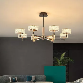
Modern Minimalist Luxury Italian Pendant Light for Living Room and Dining Area
Also available
For a separate gifting need, the store also carries: Newborn Baby Handbell, Towel, Blanket, & Milestone Set
FAQ
How high should a pendant light hang over a dining table?
A common starting point is about 28–34 inches above the tabletop. Adjust slightly higher for taller ceilings, taller diners, or brighter bulbs, and aim to keep the light source out of direct seated sightlines.
What color temperature looks best in a living room and dining area?
Most living and dining spaces look best in the 2700K–3000K range for a warm, comfortable glow. A dimmer helps fine-tune the mood from lively to relaxed without changing the fixture.
Can a pendant be installed on a dimmer switch?
Often yes, but it depends on the LED bulb or built-in driver and the dimmer type. Confirm compatibility to avoid flicker, buzzing, or a limited dimming range.
Recommended for you





Leave a comment
You must be logged in to post a comment.