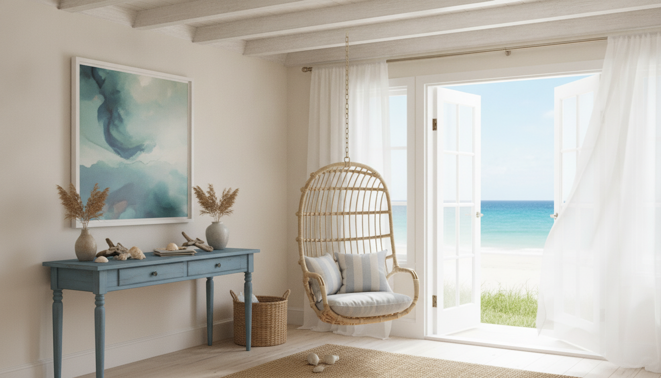
A coastal-inspired space feels light, airy, and relaxed—without turning the living room into a themed set. The goal is “breezy and lived-in,” built from sun-washed neutrals, natural textures, and a few ocean-toned accents that read calm rather than costume. Use the ideas below as a practical checklist for choosing color, texture, furniture, and finishing touches that stay consistent from room to room. For more guidance, see Complete Guide to Coastal Interior Design Style.
Coastal calm is less about seashell collections and more about how a room feels: bright, open, and effortless. Natural light is the hero, followed by soft contrast and an unfussy mix of organic textures. For further reading, see ELEGANT COASTAL CHIC DECORATING.
When the room feels “quiet,” it’s usually because the palette is edited, the finishes are mostly matte, and the décor is intentional—more negative space, fewer tiny objects competing for attention.
Coastal color works best in layers. Begin with a base that mimics sun-bleached surfaces, add grounding tones that feel natural, then bring in ocean accents sparingly for depth.
Need a quick reality check when choosing paint, textiles, and décor? Lean on reputable color guidance like the Pantone Color Institute and test samples in the room’s actual light before committing.
| Room element | Safe coastal pick | Optional pop color | Common mistake to avoid |
|---|---|---|---|
| Walls | Warm white or soft sand | Pale blue on one smaller wall | Bright icy white that feels stark |
| Sofa/large upholstery | Linen-look beige or light greige | Navy throw or lumbar pillow | Dark bulky fabric that absorbs light |
| Wood tones | Light oak, rattan, or weathered pine | Black metal in small doses | Too many mixed wood undertones |
| Textiles | Cotton, linen, gauze, boucle | Sea-glass green in a patterned pillow | High-shine satin that reads formal |
| Decor | Ceramics, glass, woven baskets | One sculptural coral-inspired piece | Theme overload (anchors, rope, signage) |
If you change only one thing, change texture. Coastal rooms often use a simple palette, so texture does the heavy lifting—warming the space and adding dimension without adding “stuff.”
For added polish, keep shiny elements limited to small touches—like a glass vase that catches the light—while the larger surfaces (tables, cabinets, hardware) stay quiet and understated.
Coastal calm is comfortable first. The room should feel easy to move through, with seating that invites you to stay and surfaces that can handle real life.
When in doubt, edit before you add. One extra side chair can be lovely—three extra small tables usually reads cluttered, even in a neutral palette. For broader styling inspiration and real-home examples, browse design features on Architectural Digest’s Decor section.
If you want a ready-to-use, room-by-room plan you can reference while shopping, try Coastal Calm: Bringing Beach Vibes Home | Digital Checklist for Coastal Decor, Beachy Interior Design, and Seaside-Inspired Home Styling. If you’re also documenting your makeover (before-and-after posts, reels, or a mini series), AI-Driven Content Ideas Toolkit: 4-in-1 Bundle of eBooks, Guides, and Checklists for Social Media Success can help you plan what to share without scrambling for captions and content angles.
For lighting, aim for warm, flattering bulbs and layered sources—table lamps, floor lamps, and overhead lighting working together. The U.S. Department of Energy’s guide to LED lighting and color temperature is a helpful reference when choosing bulbs (many coastal spaces feel best around 2700K–3000K).
Start with warm whites and sandy neutrals, ground the room with light wood tones, and add muted ocean accents like sea-glass green, dusty blue, or navy in small doses. Keeping the palette to 3–5 tones helps the whole space feel calm and cohesive.
Focus on decluttering first, then add a woven rug, linen or sheer curtains, and warm light bulbs to soften the space. Finish with one or two ocean-toned accents (like a pillow or a piece of art) instead of filling the room with themed décor.
Natural fibers like jute, rattan, linen, and cotton are the core of a relaxed seaside look, paired with matte ceramics and light wood. Layering soft textures while avoiding overly shiny finishes keeps the room feeling easy and inviting.






Leave a comment
You must be logged in to post a comment.