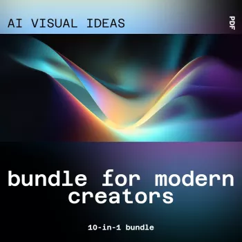
Modern creative work often stalls at the same point: translating a vague concept into a clear visual direction. When the goal is to ship campaign assets, thumbnails, landing sections, or a cohesive social series, “starting from nothing” can quietly burn hours. A 10-in-1 visual idea workflow is built to move you from uncertainty to options—fast—so you can choose a direction with confidence, keep quality high, and maintain consistency across multiple deliverables.
If you’re looking for a ready-to-run system, the AI Visual Ideas Bundle for Modern Creators | 10-in-1 AI Tools for Generating Visual and Design Ideas is designed to help creators explore styles, layouts, color decisions, and brand-ready starting points without losing control of taste or timelines.
The most expensive part of design is often the early stage—when the brief is fuzzy and every decision feels reversible. A multi-tool visual idea bundle tackles that bottleneck by producing structured options you can evaluate and refine.
Strong visual direction still depends on fundamentals—clarity, hierarchy, and balance. A quick refresher on proven principles can help you judge AI-generated directions more effectively; see Nielsen Norman Group’s overview of visual design principles.
This kind of bundle shines when you’re producing frequently, working across platforms, or collaborating with people who need to “see it” before they can approve it.
For creators who want idea generation on both the visual and editorial side, pairing a visual workflow with a planning system can tighten production even further. The AI-Driven Content Ideas Toolkit: 4-in-1 Bundle of eBooks, Guides, and Checklists for Social Media Success complements visual direction by helping you map topics into publishable series.
A reliable sprint structure prevents the most common failure mode: generating lots of attractive options that don’t converge into a usable system. The sequence below keeps exploration wide, then narrows into brand-friendly rules.
| Use case | Idea outputs | Final deliverables |
|---|---|---|
| YouTube series | 5 thumbnail directions, 3 color systems | 1 template + 6 episode thumbnails |
| Product launch | 4 hero image concepts, 10 background motifs | Landing hero + ad set variations |
| Brand refresh | 6 mood directions, 8 palette options | Mini style guide + social templates |
| Course content | 5 visual metaphors, 3 slide styles | Deck theme + module cover visuals |
Color decisions are often the quickest way to create cohesion across formats. If you need a fast framework for palette logic, Adobe’s guide to color theory is a helpful reference when locking rules for primary, secondary, and accent usage.
Accessibility is part of brand quality. For contrast, readability, and inclusive design expectations, the W3C’s WCAG overview is a strong baseline for checks before publishing.
Beginners benefit from structured starting points and repeatable templates that reduce blank-canvas stress, while experienced designers benefit from rapid iteration and faster direction-finding. In both cases, clear brand guardrails (palette, typography, and layout rules) are what turn ideas into consistent output.
Lock a palette and typography system, reuse one layout template per series, and keep 2–3 reference “anchors” that define the look. Before exporting variants, run a quick checklist for hierarchy, spacing, and contrast so every post feels like part of the same set.
Commercial use depends on the product’s license terms and any third-party tool terms involved, so it’s worth confirming both before client work. Document what was used, then apply a final brand and accessibility QA pass to ensure the deliverables meet professional standards.





Leave a comment
You must be logged in to post a comment.